
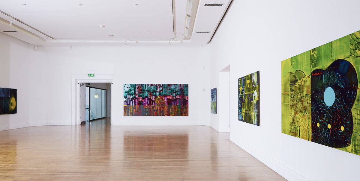
ARTIFICIAL BEE COLONY | GREEN ON RED GALLERY, 2024
THE ARTIFICIAL BEE COLONY PAINTINGS
For many years now my work has been concerned with painting in the age of artificial intelligence. An age in which our visual understanding and appreciation are continually being upgraded, as technological advancements evolve.
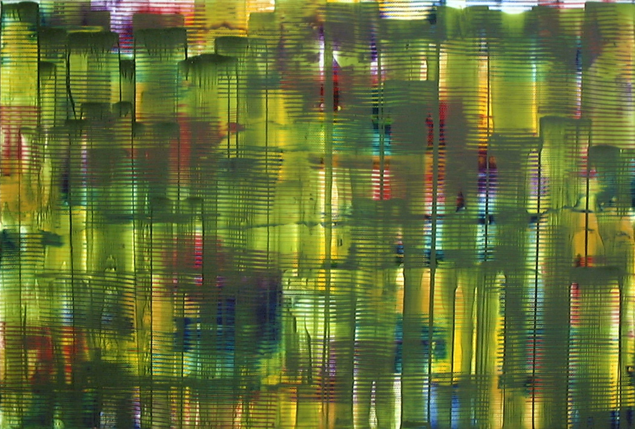
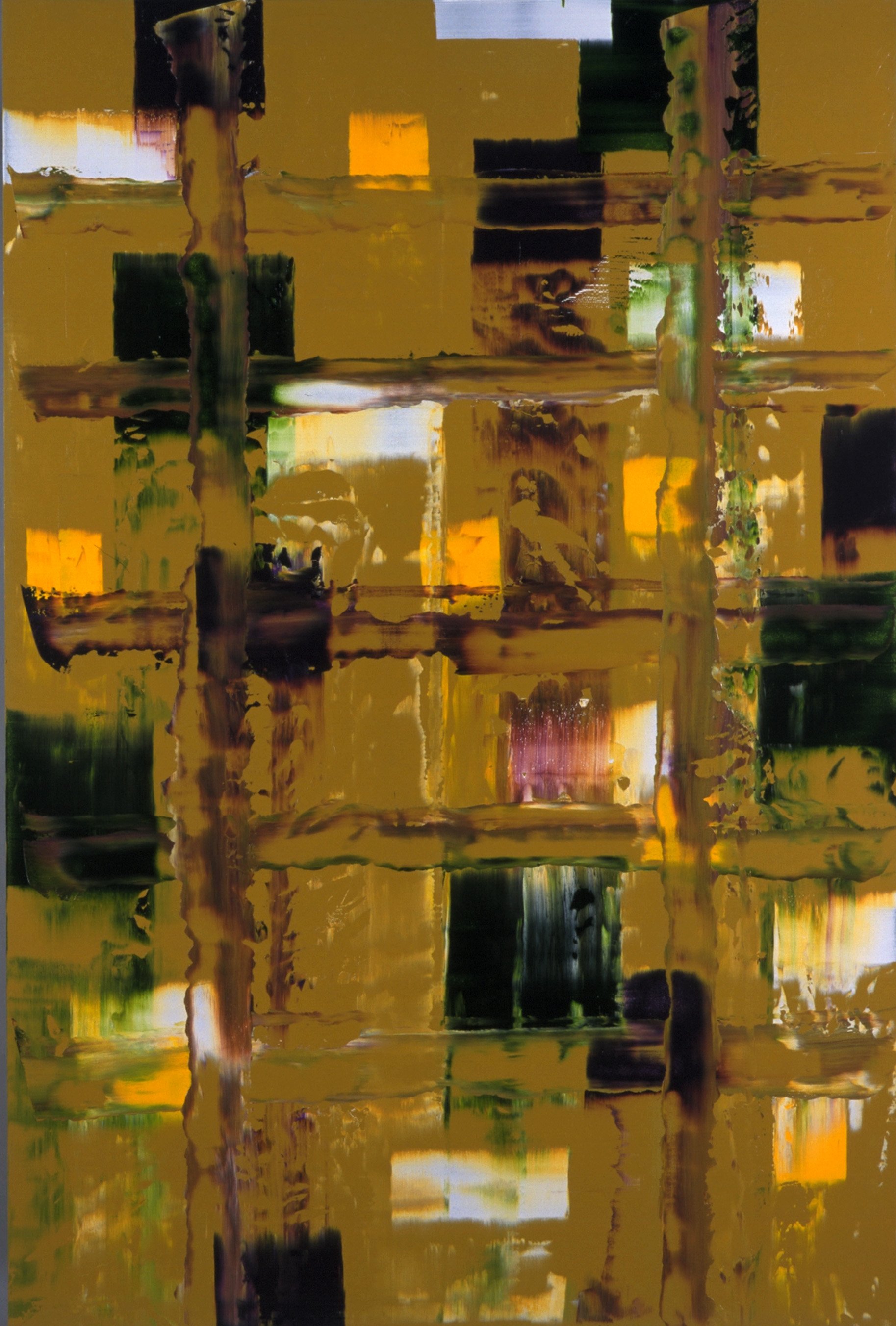
The ABC paintings are a witness to their coming into being – a process, at once slick and crude, with elements of the works breaking down both, compositionally and in their very materiality – once-luscious oil paint is cracked, dried and exhausted, arid patches vie with free flowing organic rivers of paint, watched over by morphing, pathologising, and destructive elements. The colours, while less kaleidoscopic than in previous works, are still vibrant and acidic playing with opacity, layering and translucence. Each piece has the same compositional elements, but the order of the application of those elements varies resulting in quite different outcomes.
The title comes from the Artificial Bee Colony (ABC) algorithm. This algorithm is a swarm-based optimisation technique that simulates the foraging behaviours of honeybees and is used to solve continuous optimisation problems. The algorithm, however, has several drawbacks, such as difficulty solving discrete optimisation problems and is susceptible to numerical noise. So many of the algorithms that are beginning to govern our daily lives, are trained by our culture, and are learning to automate historical bias. AI perpetuates a feedback loop that can degrade the abilities and experiences that people consider essential to being human at a time when the world is coming to terms with historical, racial and gender injustices.

ARTIFICIAL BEE COLONY 1 | HIVE MENTALITY | 2023 OIL ON CANVAS 6'x4' 182X122CMS

ARTIFICIAL BEE COLONY 2 | FEEDBACK LOOP | 2023 OIL ON CANVAS 6'x4' 182X122CMS

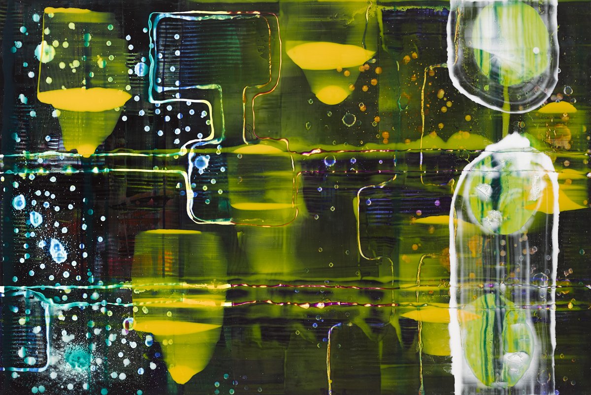
ARTIFICIAL BEE COLONY 3 | PROFILING FOR ALTERNATIVE SANCTIONS | 2023 OIL ON CANVAS 6'x4' 182X122CMS
ARTIFICIAL BEE COLONY 4 | NEAR-OPTIMAL SOLUTIONS | 2023 OIL ON CANVAS 6'x4' 182X122CMS

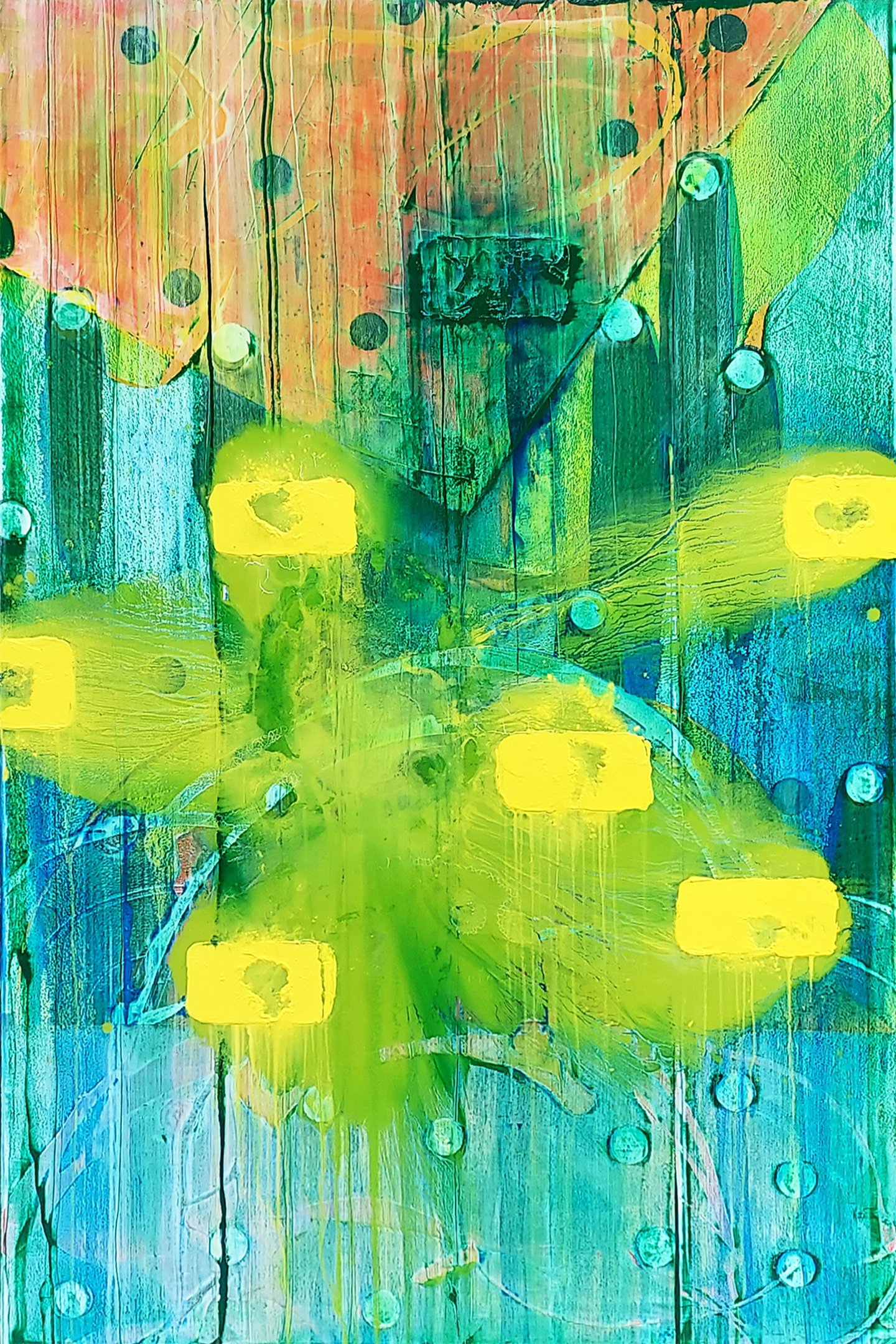
ARTIFICIAL BEE COLONY 5 | AUTOMATED BIAS | 2023 OIL ON CANVAS 6'x4' 182X122CMS

ARTIFICIAL BEE COLONY 6 | PATHOLOGISING COMMUNITY | 2023 OIL ON CANVAS 6'x4' 182X122CMS

ARTIFICIAL BEE COLONY 8 | MATH DESTRUCTION | 2023 OIL ON CANVAS 6'x4' 182X122CMS
ZXX

ZXX | ROYAL HIBERNIAN ACADEMY, 2016
Artist Statement
My work is concerned with painting in the age of artificial intelligence. An age, in which, our visual understanding and appreciation are continually being upgraded, as technological advancements evolve. At the same time, I strive for my work to reflect the society in which it is produced.
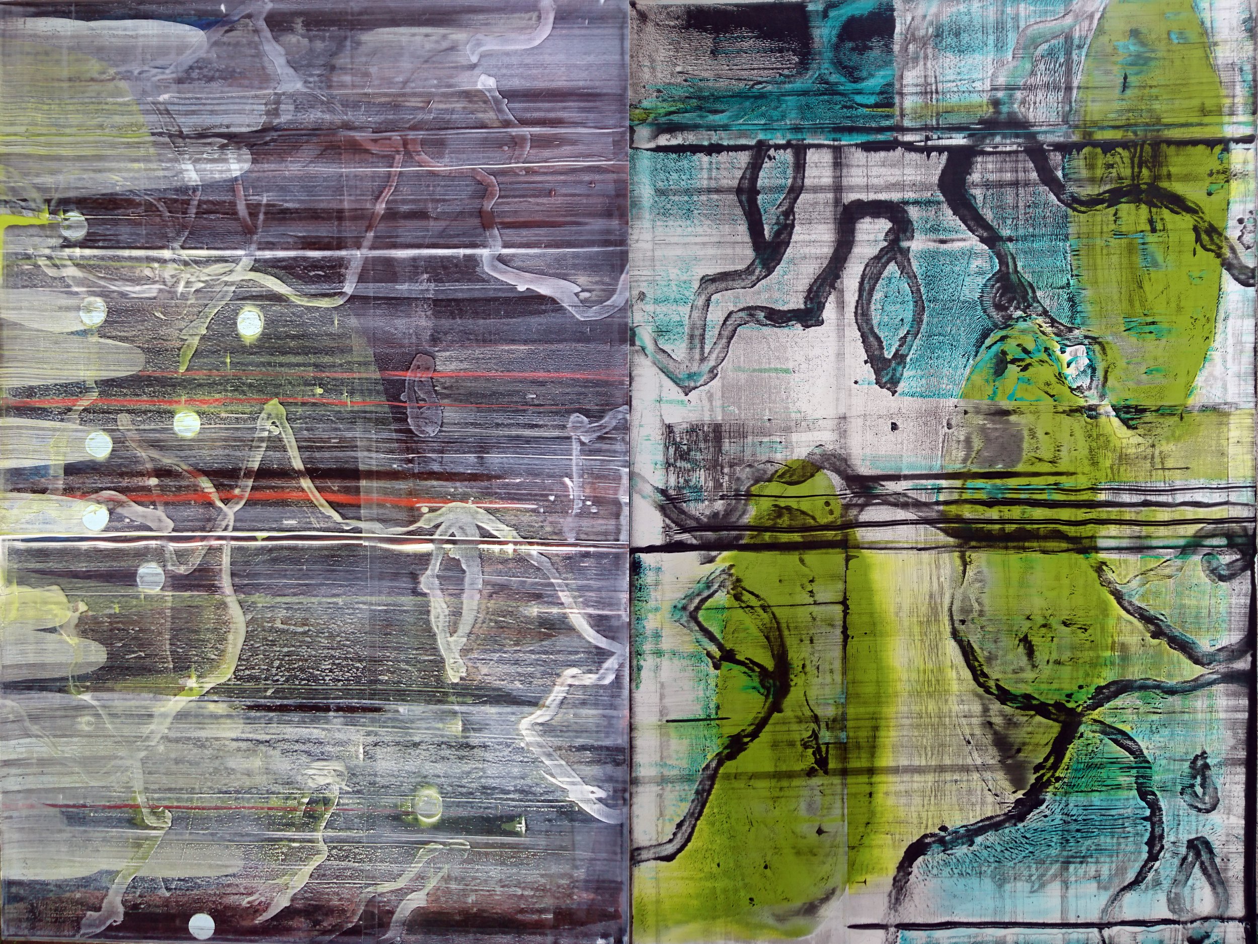
ZXX is a logical development of my Augmented Reality and Standard Deviation bodies of work. It sees me trying to take control of their corrupted elements and deviations while reflecting my continuing concerns about the processing of information.
The name ZXX comes from a system the US Library of Congress uses to denote a book’s written language. In this context, ZXX means “No linguistic content” which I intended as a metaphor for Abstraction. Another use of ZXX, as the name of a covert typeface designed by a former NSA agent Sang Mun can be interpreted abstractly. His idea was to produce a typeface to avoid optical character recognition as used in surveillance. Around this time Edward Snowden came to the world’s attention when he revealed the shocking extent of numerous global surveillance programmes. In this climate ZXX became more enticing as a title. It seemed in tune with the zeitgeist while at the same time reflected people’s growing desire to hinder the surveillance.
The beauty of ZXX (15) is that it has grown in the interim years since it was painted. The sense I was trying to convey was one of an organic network transmitting and receiving ideas. These transmissions were sometimes accurate, sometimes corrupted. The image goes beyond the confines of the canvas, alluding to the ever-expanding Internet and surveillance. The work is all the more relevant to me now as I feel my concerns were justified. A current interpretation of an ever-expanding organic network and democracy-suppressing surveillance universally rings true.
the new reality - john yau
New York, 2016
One of the pleasures of traveling to another country is the possibility of discovering the work of an artist that you would not have otherwise known.
This happened to me in the spring of 2013, while I was in Dublin, Ireland. During a day of visiting one gallery after another, I came across the abstract paintings of John Cronin in his solo exhibition, Standard Deviation, at Green on Red Gallery. It was apparent from the moment that I walked into the high-ceilinged gallery space that Cronin was up to something fresh and original. The most obvious thing – what first grabbed and held my attention – was his interest in the volatile nature of paint’s materiality and the ways it could be converted into ghostly and artificial light. The second thing that caught my notice was Cronin’s take on the status of painting at this point in the 21stcentury. Despite all the pronouncements of the death of art and the author, he seemed to believe that it was still possible to do something new under the sun.
The central question Cronin seemed to be raising was this: can painting look forward or is it doomed to gaze back at the past? Can it confront the chaotic present or is the admission of its demise – however ironically expressed – the only issue left for a painter to address? In lesser hands, these questions might have canceled each other out, since a concern with paint’s materiality often implies a nostalgia for the thick, muscular gestures of Willem de Kooning and Franz Kline, or the thin, luminous surfaces of Helen Frankenthaler and Sam Francis. Aware of his position as a late arriver, and therefore inescapably postmodern, Cronin could have opted for such familiar moves as parody and citation, or he could have elected to retrofit a past painting style in a material other than paint. Instead, he decided to apply paint in an ambitious range of methods to flat aluminum sheets — shiny and resistant industrial surfaces, which are often abutted together, edge to edge, to form long, narrow, panoramic formats. The paintings I saw did not look like anyone else’s, which made me want to look longer.
Standard Deviation, the exhibition’s title, offered a clue about what the artist was up to. The term is employed in statistics to signify “the measure that is used to quantify the amount of variation or dispersion of a set of data values.”[1] Closer to home, the phrase “margin of error ” is one we hear repeatedly in poll results in the months and days before an election. Cronin’s title suggests that the paintings have to do with charts, data, variation, and dispersion. At the same time, these illustrative terms could be used to describe Cronin’s use of paint, which has been poured (dispersed) and accumulated in a variety of similar and dissimilar configurations (data and variation).
One of the recurring motifs tying this diverse group of nine horizontal paintings together was the placement of three evenly spaced discs (red, black, or yellow) across the lower half of the composition. Do the discs represent the standard, with the rest of the elements taking on various states of deviation? Some of the circles, it should be noted, are solidly painted while others have been scraped away, leaving only a trace, and still others seem to be dissolving, suggesting that the set of three circles comprise the standard, variation, and dispersion in themselves. Which leaves the question, what is the viewer to make of the rest of the painting?
One of the strongest, most captivating things about Cronin’s paintings is the amount and diversity of visual information he brings together in a single work. Some forms seem to have been inspired by microscopic life, while others might evoke a computer screen on the fritz. What about the areas where the paint has been smeared or dragged? What about the elements that bleed into the surrounding field, as if sinking into decay? It seems to me that this condition of visual excess is a reflection of global disorder. By using paint’s materiality to evoke fields of data, “margins of error”gone awry, and corrupted and collapsing structures, Cronin has made abstractions that succeed in grappling with the digital networks and information-gathering mechanisms embedded in every part of our daily life. What makes these works even more powerful is that they never lose their identity as paintings: they don’t mimic exterior realities.
Cronin uses paint to explore the interface between the digital domain and our everyday lives. The title of his exhibition at the Royal Hibernian Academy is ZXX, which is a code meaning “no linguistic content.” Libraries use this code to signify documents that exist outside of language or language groups, that is, texts that are basically nonsense or gibberish. ZXX is also the name of a typeface that can be deciphered only by human eyes, a pictogram-like alphabet devised by the designer Sang Mun in response to the ubiquitous electronic surveillance of our emails, computers, and mobile phones. An idealist, Mun wants us to be able to hide in plain sight, to insert a buffer between ourselves and the various ways that what we do can be recorded.
Correspondingly, Cronin’s exhibition title suggests that he wants to make paintings that exist outside of language, works that cannot be decoded by the narratives of postmodernism to define and delimit the history and nature of painting. Only someone directly engaged with the painting can possibly decode it. This, of course, is the dream, isn’t it? Paintings are made for individuals, not for predetermined narratives about art history or for the collective good of society. The desire to escape the confines of language also explains why Cronin seems to have resisted developing a categorical style or signature signs. Moreover, by painting on a machine-produced, metal surface, he deliberately separates himself from the fine art tradition that has long been invested in oil on canvas or linen. In this critique of conventional practice, he shares something with three radical American painters, Thomas Nozkowski, David Reed, and Tom Burckhardt.
In 1971-72, Nozkowski began his career by painting on commercially available canvas boards that measured 16 by 20 inches. Not only did these inexpensive, modestly scaled supports carry the stigma of association with amateur and Sunday painters, but also, more importantly, they ran directly counter to the massive paintings of Frank Stella that were being vigorously promoted by the Museum of Modern Art in New York.
David Reed’s exploration of the brushstroke in the late 1970s inspired him to bring together the mechanical and the handmade in panoramic formats prefiguring Cronin’s horizontally arranged aluminum panels. His paintings, which draw from Baroque art, installation art, film, and photography, are infused with saturated color and choreographed in sudden, episodic shifts of light, shape, and texture that separate the corporeal from the spectral.
In this century, Tom Burckhardt began painting on bumpy, uneven supports made from cast plastic, sometimes daubing fat black dots around the edge as if they were thumbtacks affixing a piece of canvas to a wooden support, leading the viewer to ask, what’s real and what’s not? Each in his own way, Cronin and his American counterparts have found imaginative means to move painting forward and away from a tradition bound up with masterpieces.
Cronin’s non-absorbent surfaces deny mastery. Working on the floor, he uses various tools to apply different viscosities of paint. Puddles, drips, spills, slashes, smears, and dots mark the surfaces. Meandering trails turn into tentacles and scarred grooves. There are built-up furrows and ellipses. The paint, scraped and dragged across the surface, ranges from thick puddles to blistered surfaces to translucent films.
The distressed surfaces are visceral and optical, as if clashing strata (or realities) have been compressed together. Layers, forms, and colors peek through. Variations on particular configurations recur in a single work, though not necessarily in any logical manner. We cannot discern what is controlled from what is accidental, an ambiguity that provides one of the many pleasures the work has to offer. At the same time, everything in the painting seems to be going haywire — the pleasure turns bleak before becoming something else.
Cronin’s palette has more in common with the artificial colors found on computer screens and in the hand-painted experimental films of Stan Brakhage than with anything found in late 20th-century abstraction, such as color field painting or minimalist monochrome. At times, his alizarins remind me of Technicolor horror films, at once cheesy and weird. With their glossy, metallic artificiality, his quinacridone colors could have come from a custom car shop. Their artificiality further separates the work from the landscape, reminding us of our own deep estrangement from the natural world. What are the organisms we see in Cronin’s paintings? Are they benign or threatening, organic or genetically modified?
Cronin’s puddles, trails, grooves, ridges, and smears, often applied to long, narrow, horizontal formats, neither add up to an overall image nor dissipate into randomness and chaos. They hover in a domain that is all their own, with porous and semi-transparent forms passing through, over, and under each other, evoking a world where everything is subject to change. Are they the algorithmic disruptions of a computer invaded by malware, traces of subatomic waves and blips, or life forms you might glimpse through a microscope as they swim around a drop of pond water? Why am I simultaneously reminded of things that can be perceived only through a microscope, a radio telescope, or on a computer screen? Seeing, Cronin reminds us, is never pure. It can never be free of memories and associations. In this, we sense the artist’s argument with those who believed purity was a worthwhile goal. This is really where Cronin’s astuteness becomes apparent. He can stir up divergent associations while pulling us in different directions.
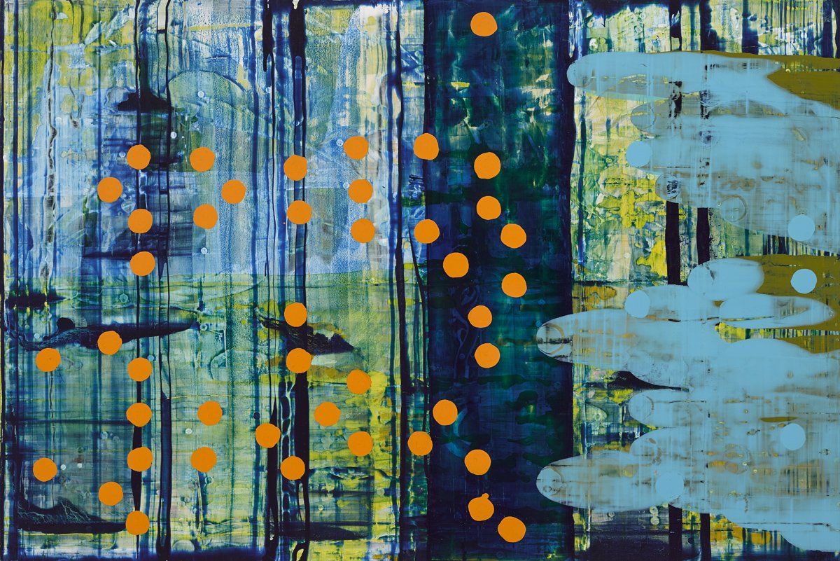
What are we to make of the orange dots floating on top of the vertical smears of blue and thalo green in “ZXX No. 8” (2016) or the ridges in “ZXX No. 7” (both 2016). Look at any of Cronin’s paintings, and you are likely to begin questioning its configurations and relationships, with a feeling of uneasiness you would rather avoid. This is the paradox animating the works. We know that we are looking at paint, but it becomes something else without losing its identity as a viscous liquid, a shiny skin, a film of luminous color. The artificial pigments come across as beautiful and poisonous, elegant and polluted, clunky and disturbing. Meanwhile, the biomorphic forms are anonymous and less than comforting, and the wrinkles, creases, and furrows seem like signs of infection. These paintings speak to our inchoate fears, our awareness that all is not right with the world.
Cronin’s paintings are a record of their coming into being, which links them to Abstract Expressionism. The difference – and it is an important one – is that they convey no attachment to the so-called glory days of postwar painting. They are done on aluminum and do not rely on gestural brushstrokes. Insubstantiality and substance embrace each other. Like movies and television shows whose plots hinge on the breakdown between what is real and what is fiction, Cronin’s paintings speak directly to that state of perceptual unease. The tentacles and organisms inhabiting his paintings give off an unearthly glow. The simultaneity of the layered, transparent forms suggests that reality is not unitary and perhaps it never was. Something unexpected is always showing up, while something else is always breaking down.
[1] https://en.wikipedia.org/wiki/Standard_deviation
ZXX | IMAGES


ZXX | INSTALLATION VIEWs, ROYAL HIBERNIAN ACADEMY, 2016


PALINODE
PALINODE | GREEN ON RED GALLERY, 2005
Modernist Painting Redivivus: John Cronin’s Abstractions by Donald Kuspit
NEW YORK, 2004
John Cronin’s paintings are profoundly beautiful: their vibrant, sensual surfaces, composed of ingeniously nuanced brushstokes, seemingly illuminated from within, have the “sensate-objectivity of beauty” that is the aesthetic core of art, as the philosopher Alexander Baumgarten argued. The illusion of inner light, giving the flat painting an inexplicable depth, has its source in the smooth, radiant aluminium planes underneath the paint as well as the outer light they seem to absorb and dissemble. Cronin’s colors appear to reflect light even as they are suffused with it. Veiled and filtered by the atmospheric color, the subtly intense light shines with revelatory promise. Cronin’s paintings are visual epiphanies: tours de force of perceptually “living form,” to use the poet Friedrich Schiller’s phrase.
They in fact have a peculiarly poetic format: the broad, linear brushstrokes seem to be written--scrawled--across the page-like surface. Rhythmically repeated, sometimes horizontally, sometimes vertically, each stroke seems to gain momentum as it streaks across the planar surface, reflexively elaborating itself in the course of doing so. Each stroke is climactic in itself--a sort of autonomous grand gesture--even as it remains embedded in the larger pattern of the painting. It is a kind of all-over painterly construction: simultaneously geometricized gesture and gesturalized geometry, each brushstroke remains bound to every other in a grid, sometimes more implicit than explicit. There is an air of controlled excitement to Cronin’s paintings: the grid gives them a classical poise--pre-ordained structure, as it were--the headlong, tangible gestures have a romantic flair.
Cronin is a process painter, or, if one wants, an abstract expressionist. His painterly gestures seem inexhaustibly energetic, as though driven by hidden currents, although their (often) precisely delineated edges and (relative) regularity suggest a certain constraint, perhaps more imposed than inherent. However self-dramatizing and forceful, Cronin’s gestures have boundaries. The great abstract expressionist achievement is to make paint seem like a freshly discovered, magically mercurial material, even as it also looks exquisitely refined and precious. It is Cronin’s achievement; it suggests his total mastery of his material. But for all their conspicuous physicality Cronin’s paintings are covertly sublime: they suggest romantic yearning for the unrepresentable. They have expressive significance as well as material power. Indeed, the more physically exciting they become, the more they seem dense with unutterable emotion. Ecstatically compact and intimate--Cronin eschews the mural expansiveness of late abstract expressionist painting, with its “metaphysical” pretensions--Cronin’s paintings resonate with the unnamable “superfine feelings” that Kandinsky thought were the gist of abstract painting. If aesthetics “deals with the subtlest experiences of sensation,” as the philosopher Johann Gottfried von Herder thought, then it necessarily deals with the subtlest emotional experiences. Each of Cronin’s peculiarly delirious, moody brushstrokes is a singular aesthetic unity of subtle sensation and feeling. Compiled and structured in his painting, they hammer home the simultaneity of immediate sensation and subliminal feeling.
The Nightingale series, 2002 suggest that Cronin’s paintings are not simply material process absolutized. Does the series allude to Keats’ poem “Ode to a Nightingale?” The songbird is a familiar romantic symbol, all the more so because its melodies are often heard at night, making them seem mysterious. But I am arguing that the literary import of Cronin’s paintings is secondary to their purity: abstract color-saturated works, they mirror, with whatever dynamic distortions, the flat surfaces on which they are painted. Indeed, they seem to embody flatness--give it a painterly body, as it were. Their textural richness adumbrates their flatness, which informs every brushstroke. This flatness, repeatedly finessed and confirmed by every gesture, however extravagant, is the telltale sign of modernist painting--self-referential or “tautological” painting, as Clement Greenberg argued. Another important sign is the acknowledgement of the painting’s edges, evident in Cronin’s brushstrokes as well as in the fact that in some paintings they abruptly stop at the top edge of the work, in a way reminiscent of Morris Louis--one of Greenberg’s post-painterly abstractionists. I am suggesting that Cronin is a modernist painter--but a modernist painter with a difference: he reconciles romantic expressivity and positivistic physicality, which Greenberg, the originator of the concept of modernist painting, said could not be reconciled.
Cronin offers us a new abstract “musical painting,” as both Greenberg and Kandinsky called it--one in which seemingly staccato brushstrokes converge in a new harmony. One might call it a post-”apocalyptic” abstract painting, to refer to a term that has been applied to Kandinsky’s all-over paintings--or a post-”chaotic” abstract painting, to use the term that was applied to Pollock’s all-over paintings when they first appeared. Like them, Cronin is a romantic, but his romanticism is less troubled and violent. One might say that where Kandinsky and Pollock orchestrate on a grand scale, Cronin’s paintings are chamber music. Their romanticism is concentrated and insinuating rather than cosmic and outspoken, which makes for a deeper emotional as well as sensuous experience.
For Greenberg, romanticism, whether in updated Expressionistic or Surrealistic form, was old-fashioned compared to positivism, which is quintessentially modern. Positivistic modernist painting may convey what Greenberg called the mood of the Zeitgeist--he spoke, in very general, thin terms, of the “optimistic materialism” of early modern art and the “existential pessimism” of Abstract Expressionism--but this hardly meant that it was romantically self-indulgent. Impersonal fact rather than personal feeling was uppermost in it, he said--feeling, such as it was, was an epiphenomenal effect of candid, mastered fact. Since Greenberg wrote, modernist painting has become an academic cliché; flatness has been repudiated by such early advocates as Frank Stella and Larry Poons, and Greenberg’s emphasis on the “material facts of the medium” as the be-all and end-all of art has given way to ideological conceptualism. Indeed, painting has been regarded as dead or in mourning for itself, as one theorist ironically puts it.
But painting has obviously remained alive and well, if one cares to look. So has modernist painting: Cronin breathes new esthetic life into it--by making it romantic, thus breaking the taboo on the expression of seemingly “excess feeling” that Greenberg said has more to do with life than art, which is always concerned with “decorative unity” rather than chaotic self-expression. (Chaim Soutine was his example of a painter who confused the two, thus failing as a painter however much he succeeded in expressing his conficted feelings.) Restoring what Greenberg dismissed as “the preconscious and unconscious order of effects” that were beside the point of “the literal order of effects” that gave the painting its aesthetic authenticity, Cronin creates a psychodramatically new modernist painting. Cronin reminds us that each without the other is meaningless and uncreative, resulting in an aesthetically unsatisfactory--even creatively immature--art. One of the complaints about modernist painting, particularly in its post-painterly version, was that the expressivity had been leeched out of it in the name of literalness. This is the reason that Stella and Poons questioned it while trying to make it more expressively resonant rather than simply esthetically self-sufficient.
I think that Cronin has succeeded more than they have because he returned to the condensed easel format, as I have noted, which allows for a greater concentration of purpose. Without the deepening expressive effect, modernist painting becomes empty estheticism--hollow beauty, as it were--as seems to have happened in the work of Ellsworth Kelly, Kenneth Noland, and Jules Olitski in the sixties. Their is a thinness to their surface that suggests expressive inadequacy. In contrast, Cronin is a romantically dynamic literalist. In a sense, his works are postmodernist modernist painting, for they bring together what Greenberg thought had to be kept apart. Modernist painting had become routinely matter of fact and boring, but in Cronin it once again becomes a source of tangible pleasure. Indeed, Cronin’s paintings are seductive--profoundly erotic. They have that “something strange”--something romantic--that the philosopher Francis Bacon thought gave “the proportions of (classical) beauty”--we see such proportions in the arrangement of Cronin’s brushstrokes--their impact.
Cronin’s expressive extension of modernist painting would be unacceptable to Greenberg, but Cronin’s statement that his “work is concerned with painting in the age of artificial intelligence” would be more acceptable to him. It reinforces Greenberg’s belief that modernist painting has a certain scientific bent. As he said, “the Neo-Impressionists were not altogether misguided when they flirted with science.” The purer--more modernist--painting becomes, the more “scientific” and “consistent” the method of its making, and the more the final painting has a “technological” look. It becomes unequivocally artificial--an abstract version of what Baudelaire called an “artificial paradise”; there are no naturalistic illusions--no hint of verisimilitude of any kind. There is a certain “scientific” consistency and precision to Cronin’s handling, however dynamic; the one does not preclude the other, as Greenberg noted. Also, the aluminium surface on which Cronin paints is a technological advance--indeed, represents “the technological age” in which Cronin says we live (but his romanticism shows that he refused to allow the age to be totally technological)--and gives the work a technological sheen. Glossy aluminium is certainly a more modern material--a manufactured material--than the natural cloth canvas or wooden panel on which paintings have traditionally been made. Thus to put old-fashioned oil paint on new-fangled aluminium is to renew painting that is, to make new perceptual effects and expressive resonance possible. If one compares Cronin’s stripes with those of Gene Davis, Louis, and Noland, we see just how new.
Strange as it may seem to say so, in critically extending modernist painting by “modernizing” it through his use of aluminium planes and expressive excess, Cronin reinforces Greenberg’s theory that modernist painting is inherently self-critical. As Greenberg famously wrote in his 1965 essay on modernist painting: “the essence of Modernism lies...in the use of the characteristic methods of a discipline to criticize the discipline itself--not in order to subvert it, but to entrench it more firmly in its area of competence.” Cronin is clearly competent and disciplined, but the important point to be made about his work is that its critical “revision” of modernist painting gives it a greater “esthetic consistency”--Greenberg’s term--than it had before, in the sense in which Greenberg said that consistency made for authenticity.
The quotations from Greenberg are from “Modernist Painting” (1965), The New Art, ed. Gregory Battcock (New York: Dutton, 1973), pp. 66-77
PALINODE | IMAGES


OTHER SELECTED EXHIBITIONS
WARME NIGHTS, SWEETE DEWES, FAT GROUNDE AND MISTY
MORNINGS.
2017, GREEN ON RED GALLERY, DUBLIN

STANDARD DEVIATION
2013, GREEN ON RED GALLERY, DUBLIN
REVIEW IN Hyperallergic: Too Big for His Pond: The Irish Abstract Painter John Cronin

AUGMENTED REALITY
2011, GREEN ON RED GALLERY, DUBLIN
REVIEWED ON THE VIEW, RTE 1 (TELEVISION PANEL DISCUSSION BROADCAST 24/5/2011)
http://www.rte.ie/tv/theview/archive/20110524.html
REVIEW - Rosa Abbott Art Desk

“JOHN CRONIN -
NEW PAINTINGS”
2009, GREEN ON RED GALLERY, DUBLIN
REVIEW - Entering a new visual zone - Irish Arts Review - Spring 2009 Edition - Jane Humphries

THE NIGHTINGALE
2003, GREEN ON RED GALLERY, DUBLIN
MHz
1999, GREEN ON RED GALLERY, DUBLIN